Hot on the heels of my previous post about subway station plaques, it appears three new San Francisco subway stations are online: well, on the web, anyway.
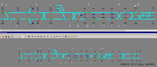
Today I was making my way to Muni Metro and happened to pull up SF Muni Central on my phone to see if I had any chance of getting a train at a reasonable time. But something looked a bit off.
See, normally the SF Muni Central website displays a screenshot of the train positions in the subway. It’s part of the train control system and not very user friendly, but it’s easy enough to figure out once you’ve gotten used to it.
This time, a separate section appeared underneath the subway map…

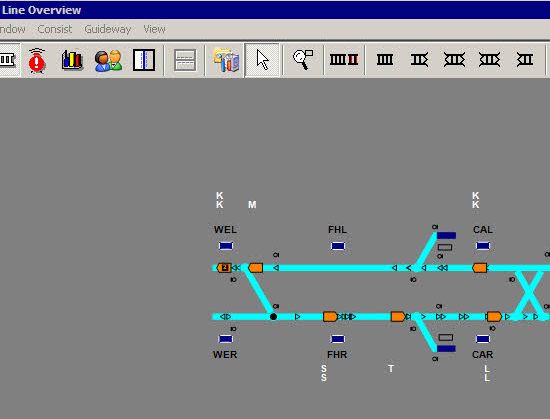
It’s clearly a desktop window with the title “Line Overview.” But why? What does this even mean?
I’m going to make a wild assumption this is something we wouldn’t normally see: the user interface for the train control system. If you do a Google image search for the keywords “thales line overview” you’ll find slides with screenshots that look remarkably similar to this. Thales is the company that provides Muni’s train control, now that Thales owns a former division of Alcatel — it’s all very complicated.

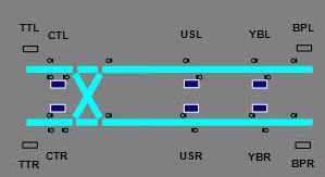
But I’ve saved the best for last. On the bottom right is a new subway! Yes, it’s the yet-to-open Central Subway.
Following Muni’s convention of three letter platform designations with the first two letters indicating the name of the station, we have:
- CT: Chinatown
- US: Union Square
- YB: Yerba Buena
The other two platforms at either end are presumably for maintenance purposes.
Now, obviously this isn’t finalized and probably not even meant to be shown to the public, but if this is the layout I’m already seeing two big problems.
- There’s only one place for trains to turn around at the end. We saw how poorly this worked with Embarcadero back in the day, with Muni eventually moving the turnback into the N-Judah extension that had room for more than one “scissor” turnback section. That could be a problem if a lot of people are using the subway to get to Warriors games, for example.
- The entire map seems flipped around. Conventionally Muni Metro has positioned outbound to inbound as right to left, but here it’s the opposite. Unless they intend Chinatown to be an outbound station, but that wouldn’t really make sense — inbound has always meant “towards downtown.” I hope that’s not how they’re going to label the stations, because that would be very confusing.
We’ll know more once the Central Subway finally opens. But as of now we don’t even have an official opening date yet.
Update: The bottom half of the image disappeared from SF Muni Central the next day.
