This year I’ve been doing a number of “30 day” projects where I try to see what I can accomplish in my spare time in only 30 days. For July I decided to focus on photography. First I had to come up with some rules and make some decisions about what I was going to photograph and how.
Here are the rules I came up with:
- Take at least 30 photos during the 30 days. This turned out not to be a worry at all, I took well over ten times that amount; the difficulty was in narrowing it down to the best of the bunch.
- Give back to the community by offering the photos under an open license. I decided on a Creative Commons attribution, non-commercial, share alike license and marked the photos as such on Flickr.
- Only photograph with my iPhone 6 and only make minor adjustments to the photos. I didn’t want to distract myself with tools I didn’t already have in my pocket, and didn’t want to dive into RAW photo development either. This was to limit the scope of the project so it would fit in a 30 day period.
- Most importantly, the photos needed a theme. I went with “Turn Up,” which I’ll describe more below.
The theme “Turn Up” comes from something I’ve heard from two disparate sources, video game designers and urban planners. Both point out that when left to our own devices, we typically don’t turn our head to look upward at the world above us. Sure, there’s a whole other world up there, but we rarely stop to look at it. Urban planners take this to mean that we should focus design efforts on making street level experience as friendly as possible and worry less about making, say, the exterior of higher levels of an office tower visually pleasing. Video game designers on the other hand have to find various ways to suggest aiming the mouse/controller up to see the rest of a puzzle, for example.
The corollary to this philosophy I suppose is telling someone who’s afraid of heights not to look down when they walk over a bridge, which of course is what they’ll inevitably do when told not to. People are like that.
Through the perspective of the lens of a camera, looking upward feels just as awkward as it does through our own eyes. For this reason many photographers stay way from such photos, lamenting the unnatural, often forced nature of this perspective. Part of that “otherness” I would argue is an odd feeling of familiarity. We were all children once, and we were constantly looking up at adults, taller children, or pretty much everything. The world is not made for small people.
Whatever the case, that sense of otherness is exactly what excites me about such perspectives. So for the past month I’ve been wandering around the city, finding tall things to look up at and often squatting down to photograph them from low angles.
And here, in no particular order, are the results.
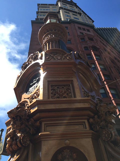
1. Lotta’s Fountain
Contrasted by the much newer buildings behind it, we look upward to the 1875 Lotta’s Fountain on 3rd and Market. According to legend, the fountain served as a meeting place for survivors of the 1906 earthquake and fire, which is why people still meet there every year far too early in the morning on April 18th. The fountain was restored in the late 90’s.
Allegedly the fountain is still operated on special occasions, but I have to admit I’ve never seen water flowing through it.
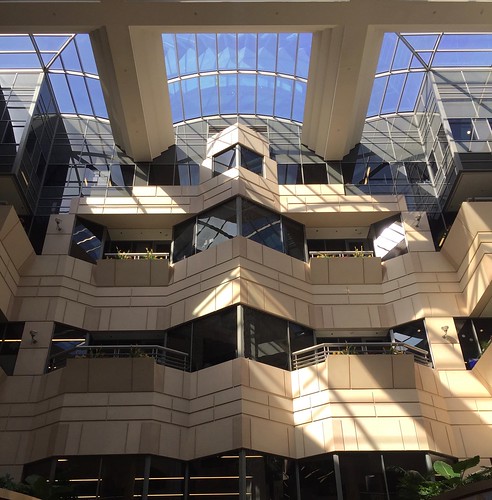
2. Rincon Center atrium
Sometimes I wonder how many health-conscious office workers grabbing vegetarian quinoa bowls for lunch at the Rincon Center’s outdoor plaza ever explore the rest of the complex. My guess is not many.
Built adjacent to an old post office that was preserved for its historic murals is a 1980’s office/retail complex with a beautiful sun filled atrium (yes, we’re getting to that other downtown 1980’s atrium in a moment, hold your horses there folks.) What overshadows this atrium more than a cloudy day is the water feature in the center, where water falls from a shower head several stories above to collect in a pool in the middle of the floor. This in and of itself is all well and good, but a sign next to the pool of water claims that this is actually part of the building’s climate control system.
This is a claim so dubious I have to wonder if anyone out there believes it. Certainly if a fountain designer discovered a way to stabilize a building’s temperature with a water spout we’d all be doing this, because traditional HVAC systems are notorious for creating cold/hot spots, and have to be repaired all the time by grumpy maintenance workers. So if you believe a fountain can accomplish what an air conditioner cannot, I have a bridge to sell you.
3. Contemporary Jewish Museum
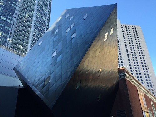
I’m not sure what it is with Jewish museums and wild architecture that eschews standard 90 degree angles, but that seems to be some sort of unwritten rule. This photo captures the Contemporary Jewish Museum (or the “Jewseum” as the hip kids call it) at its most unexpected angle, framed against the backdrop of more typical architecture.
The cube structure is made from steel panels, jutting out from a much older brick building that once served as a PG&E substation. The museum opened in 2008.
4. Old Mint
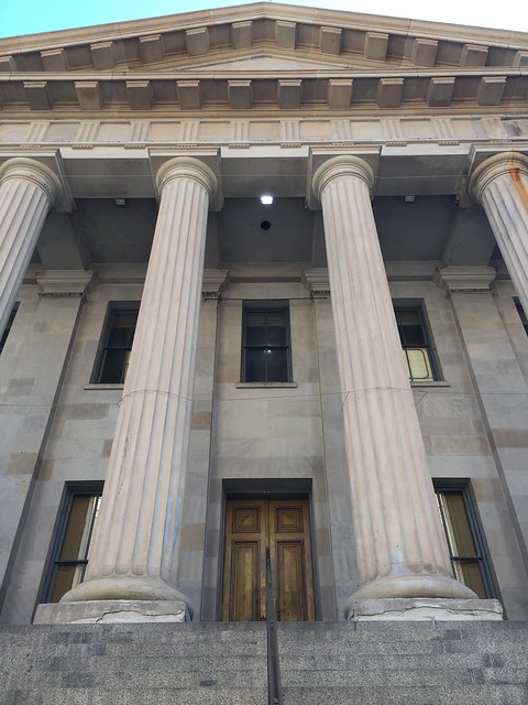
The Old Mint at 5th and Mission was actually San Francisco’s second US Mint, which was eventually replaced by the one behind the Safeway at Church and Market today. While the New Mint no longer prints currency, it’s still used to stamp out special collectible coins.
What makes the Old Mint photogenic in part is the fact that it’s been recently restored. Occasionally plans have been floated to turn the building into a permanent museum, but so far nobody’s been able to raise enough funds to do so. If only someone had a machine that printed money…
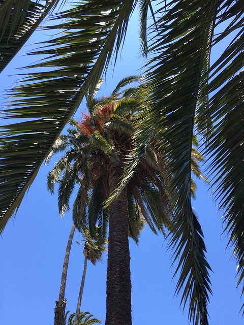
5. Dolores Street’s palm trees
Dolores Street is one of the most consistently sunny parts of the city, so it makes sense that the street’s wide median is covered in palm trees. In this photo I tried to capture several trees of various heights on one such sunny day.
The trick to capturing this photo wasn’t so much the angle or getting the palm leaves to frame the photo, but rather kneeling in the grassy median without getting dog shit on my pants. Even as a hobby, photography is truly a glamorous endeavor.
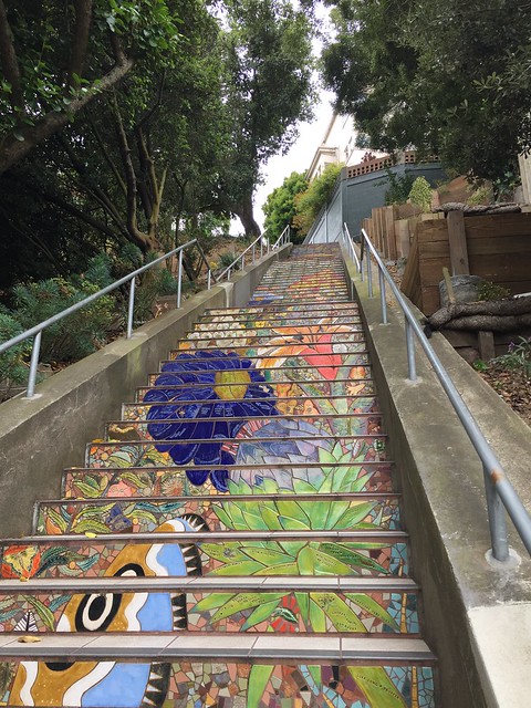
6. 16th Avenue Steps
There are several places in San Francisco where a street or avenue is so steep and narrow that it’s actually a staircase. One section of 16th Avenue is an example of this.
Back in 2003 a local resident decided that the bland concrete steps could use some sprucing up, and two years later a long colorful mosaic was installed on the 16th Avenue stairs. If you want to see what the stairs used to look like, walk about a block east to see a separate staircase that never got a mosaic upgrade.
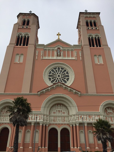
7. St. Anne Church
While the Catholic Church may not approve of Barbie, there’s no question in my mind that Barbie would approve of this aggressively pink Catholic Church. The palm trees out front make it look like something from LA, the gray skies above in this photo make it clear this is in the Sunset District.
The 1930’s building features asymmetrical towers and dozens of white plaster sculptures stuck just above the entryway. Fog permitting, the towers are often visible from across the Sunset District.
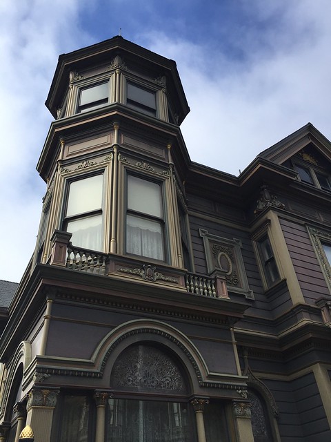
8. Spencer House
Across from Buena Vista Park at Haight and Baker is a classic Queen Anne Victorian known as the Spencer House. Built for a man named John Spencer in the late 19th century, the mansion was restored about 15 years ago. Unlike many of its contemporary buildings it was never converted from a single family home into apartments.
One important note: unlike the other Queen Anne Victorian later down this list, you may be able to afford to stay in this one if only for a few nights. Even if you’re not interested in booking the room, check that link for some shots of the home’s gorgeous interiors.
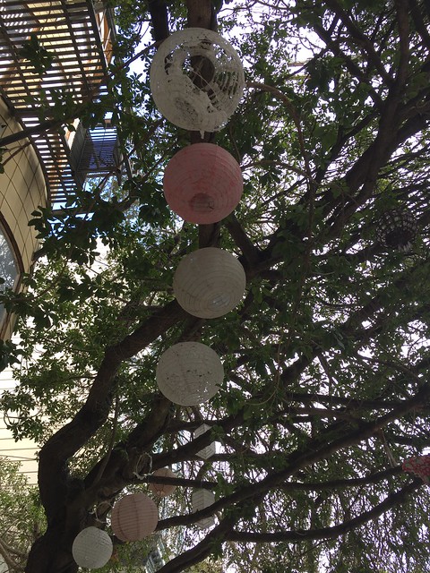
9. Sanchez Street tree lanterns
Not far from Duboce Park Cafe I happened to look up and spot these paper lanterns hanging out in the trees above. Who put them there? Why are they there? I have no idea, but it’s some harmless fun.
Oh, and to the half naked guy in the window I accidentally took a photo of when I was trying to capture the paper lanterns? Sorry! I deleted that photo.
10. Armory
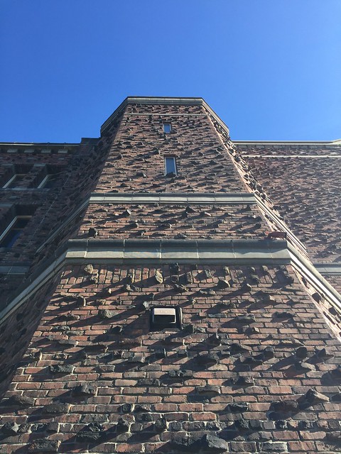
What can you say about the Armory that hasn’t been said already? It started out as an actual armory, and it sure looks like one. Since then it was briefly a hospital, it’s hosted various events, and now it’s a porn studio that occasionally hosts concerts.
From this angle it almost looks like the building is begging a rock climber to come along and try to climb up it. Come to think of it, that’s probably not the best design for an armory. Then again, I’m pretty sure rock climbing wasn’t as big in 1914 as it is today.
11. Forest Hill Station stairs
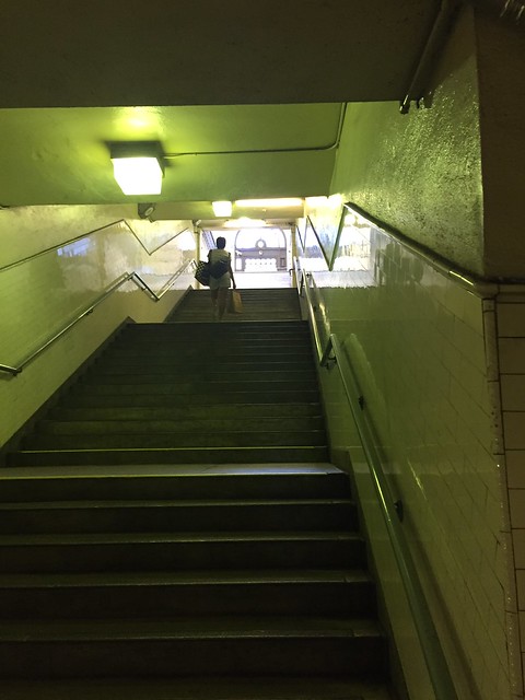
In college I was taking Muni Metro somewhere with a friend and we got out in Forest Hill Station. He started walking towards the stairs, so I stopped him and said we should just take the elevator. He looked at me like I was insane and said, “Do you really trust Muni to rescue you if you get stuck in a broken elevator?”
Sadly, he had a point. But despite being the deepest underground of all of Muni’s subway stations, the stairs aren’t as strenuous of a walk as they look at first glance. Besides, it’s the oldest subway station in San Francisco that hasn’t been renovated. It still looks almost exactly like it did when it appeared in the film Dirty Harry, and by then it was already over 50 years old. So if you skip out on the stairs you’re missing part of the old-time aesthetic of the station.
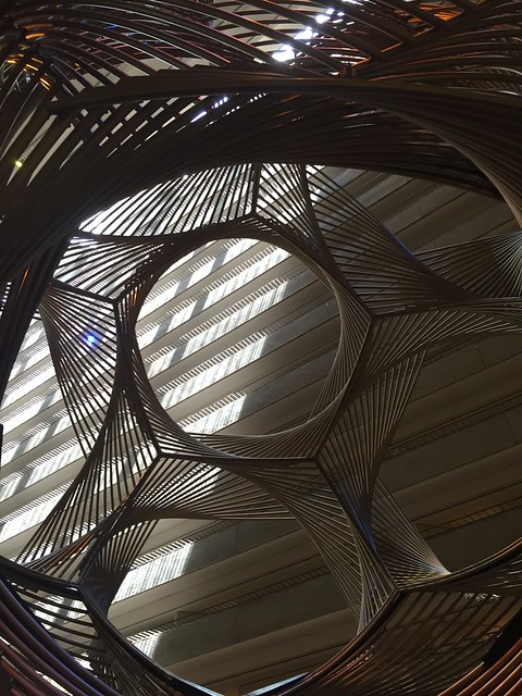
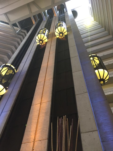
12 and 13. Hyatt Regency San Francisco’s atrium
This late 1980’s hotel in the Embarcadero Center is one those places where you might wander in and be so busy with your luggage or whatever that you forget to look up. This would be a mistake; between the wildly designed elevators to the pyramid of floors above, the atrium does itself a disservice by holding the world record for the largest indoor atrium. That’s so missing the point of the spectacle of this incredible space.
I first found myself in here as a teenager, and I’ve returned many times. It still blows me away.
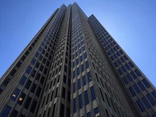
14. Embarcadero Center tower
The Embarcadero Center took nearly two decades to build, and features an open-air mall topped with four office towers. Each tower has a similar design, but they’re all ever-so-slightly different. From far away you could be forgiven for mistaking the towers to be featureless and rectangular, but up close the rectangles have an unexpected, almost organic nature.
I’ve already forgotten which tower is reaching for the sky in this photo, but it’s definitely either One or Four (the two taller ones.)
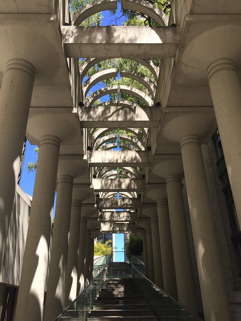
15. Embarcadero Center entry hall
Okay, one more photo from the Embarcadero Center and then we’re moving on. I promise.
This plant-lined hallway with a gentle stairway takes you into the Embarcadero Center. Look up and you’ll see a plant-lined trellis of sorts above, but be careful not to trip on the stairs while you’re doing so. Unfortunately nobody ever seems to use this entrance to the western side of the complex, which is a shame because it’s so photogenic.
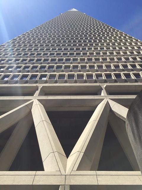
16. Transamerica Pyramid
Sometimes you just have to go with a safe choice, and the Transamerica Pyramid is exactly that. It’s safe because it’s an icon of San Francisco.
The depression-era Glass–Steagall Act forced Bank of America to spin off its insurance division into a separate company, which they named Transamerica. Decades later both firms built nearby skyscrapers in the Financial District. This shot was tricky to get because the building is currently surrounded on all sides with maintenance equipment, so forgive me for the unintended lens flare.
From this angle it looks like either an alien space shuttle, or some sort of highway to the sky.
17. Coit Tower
While we’re talking about the most iconic structures of San Francisco, here’s Coit Tower. Looking up at it from this angle, it seems to almost touch the sky. Or maybe that’s just me hallucinating after climbing what felt like a million stairs to snap this photo.
You’ve probably at least been inside the lobby of Coit Tower and looked at the murals, but — did you know? — there’s a second floor with even more murals. It’s typically only open to the public on special tours.
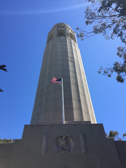
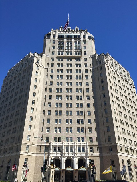
18. Mark Hopkins Hotel
It’s almost impossible not to look up at this hotel, seeing as how it’s one of the tallest structures on top of Nob Hill. The hotel is named after a railroad baron who once lived on Nob Hill.
According to a City Guides tour guide, it was a tradition for women to take their husbands or boyfriends to the top floor bar, the “Top of the Mark,” before he was sent away to fight in World War Two. The bar is still there today.
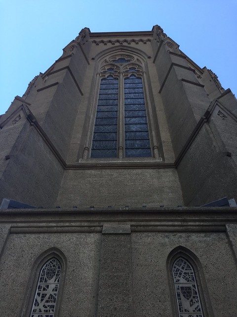
19. Grace Cathedral
For all its luxuries, Nob Hill is topped with a poor man’s 20th century knockoff of Paris’ Notre Dame Cathedral. But if you ignore the drab exterior walls, the ornate windows — such as these in the back — have merit in their own right.
Initially I’d planned on photographing the towers on the front, but those were covered in a giant banner at the time. I “settled” for the back, but in retrospect this is a more unusual shot. A happy accident, as they say.
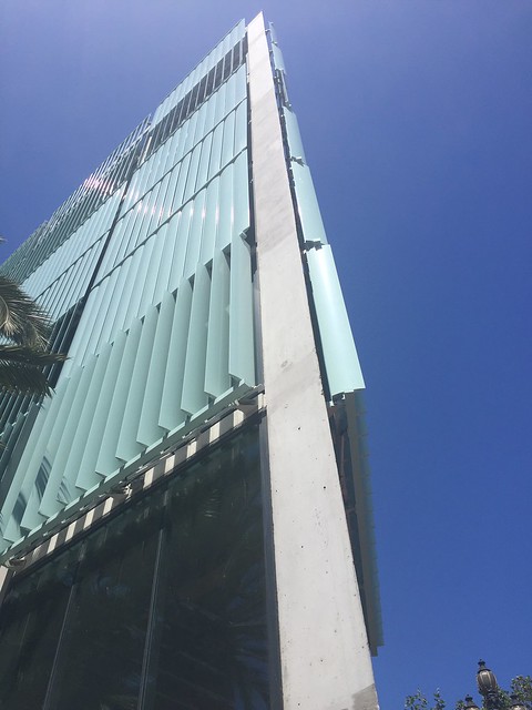
20. 8 Octavia
This condo complex seems to elicit very strong love-it-or-hate-it reactions. Personally I lean more towards the love it side simply because it’s different. I’ve never seen anything with fins quite like that outside of the heatsink squished on top of the CPU in my computer. That said, I wouldn’t want to be the guy who had to clean this building’s windows.
It took a good ten minutes to get a photo that came out at all — those glass fins are all too happy to reflect sunlight into a camera lens, so this might be a good place to live if you’re constantly hounded by paparazzi.
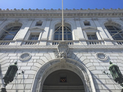
21. Supreme Court of California (Earl Warren Building)
This classic-looking building only dates back to the 1920’s, but has been added onto over the years. It was badly damaged in the Loma Prieta earthquake but has been repaired since. The courtrooms are supposed to look quite nice, but if it means getting roped into a jury I’m happy to take in all in from the outside. The law and justice motifs mean there’s no mistaking this place, it’s definitely a court house.
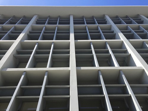
22. UC Hastings College of the Law
The pure blandness of this building makes it stick out like a sore thumb in the Civic Center area, completely out of touch with the classic French look of the rest of the neighborhood. (See #21 which is right down the street from here.) But the clean geometric lines also beg for this type of photographic treatment, flipping the blandness to an unexpected angle where it’s almost enduring.
Planning insists that this building dates back to 1907 — if that’s true it clearly must have been overhauled in the mid 20th century.
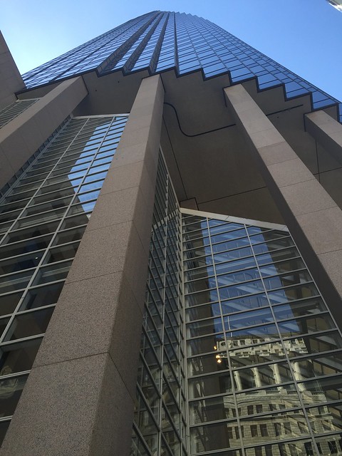
23. 101 California Street
This early 80’s skyscraper is notable for its round shape and the impossible-looking triangular “bite” taken out of its glassy lobby. The structure essentially stands on massive stilts, which seems ill-advised but what do I know — the place survived the 1989 Loma Prieta earthquake. I think it looks more daring in person than it does in any photo I took of it, but this was the most intriguing photo of the bunch.
Unfortunately architecture is not what the building is best known for. It was the site of a grizzly mass shooting by a deranged gunman who thought MSG was controlling his brain, or something. This tragic incident led to a short-lived ban on assault weapons.
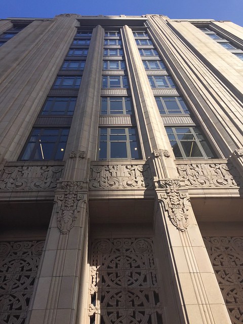
24. Twitter’s headquarters, aka San Francisco Furniture Mart
This 1937 Art Deco building was once the home of San Francisco Furniture Mart, also known simply as “SF Mart.” It closed in 2008 and sat empty for a number of years until it was converted to offices and Twitter moved in (along with several other companies) enticed to the area under a bizarre tax deal, even by the standards of San Francisco tax laws.
Historical notes aside, the ornate geometry of the Art Deco styling coupled with the brown exterior almost makes this building look like an ancient tomb that Indiana Jones might pillage.
25 and 26. Sutro Tower before and after
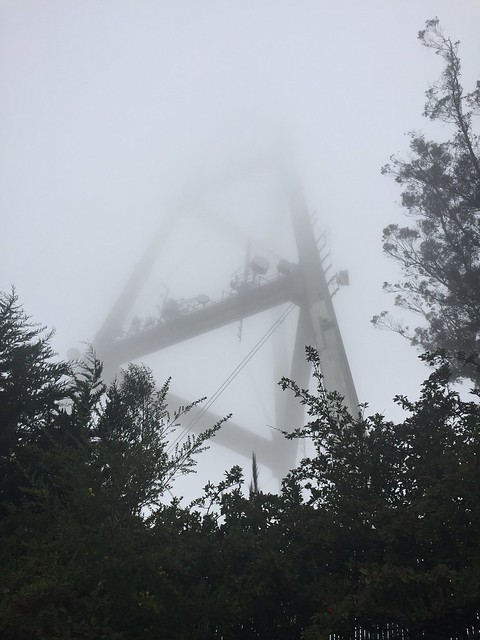
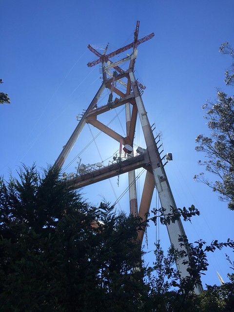
The other day when I hiked up Mount Sutro I had this sneaky idea that I’d head over to Sutro Tower and take some photos of it for this project. But our old pal Karl The Fog had some different ideas, and was looming over Twin Peaks by the time I’d made it out of the woods.
So I had to return the following weekend to get a clear shot of Sutro Tower without Karl’s cold embrace, but decided to include both photos as an exercise in contrasts. As it turned out, getting a shot of Sutro Tower from the same angle was much more difficult when I had to carefully position myself so that the tower blocked out direct sunlight. The two photos don’t quite line up, but this was my best attempt.
27. Mission Dolores Basilica tower
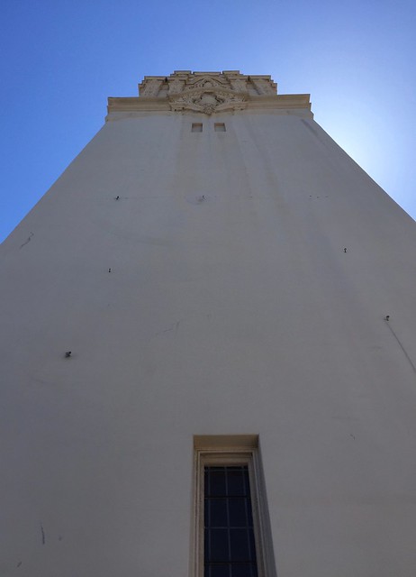
After the 1906 earthquake knocked down the Gothic-style brick church that once stood here, a stucco building replaced it. What you see here is the bell tower from the 16th Street side. Apparently it was a bit bland until they added some finishing touches to it in the mid 1920’s. From this angle you can’t see the bells but that’s probably for the best given the pigeon netting that would be visible.
28. Market Street pedestrian/bike overpass
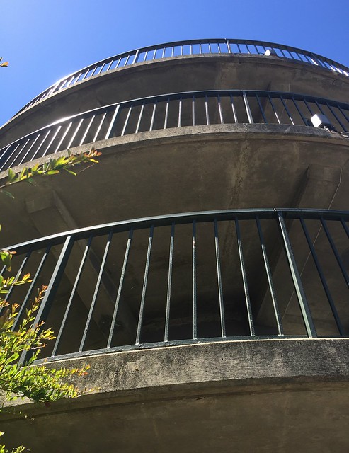
If you’ve ever made the hike up Twin Peaks from Noe Valley this may be a familiar sight. This tower winds around at a gentle slope to take you up to a bridge that crosses over the hilly part of Market Street. If walking up or down this thing doesn’t make you at least somewhat dizzy, nothing will. Fortunately since it’s on a hill you’re at ground level on the other side.
While the geometry of the corkscrew design makes for an interesting photo, I’m not sure I’d want to be walking in this thing during an earthquake.
29. SFMOMA expansion
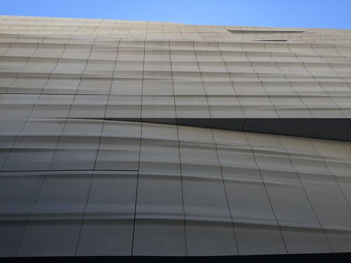
Designed by architecture firm Snøhetta, the expansion of the SFMOMA includes a white “skin” to the back of the building that looks like an undulating wave. Particularly at this extreme angle, it feels as though you’re floating across a slightly off-white sea.
30. John Daly’s mansion at 21st and Guerrero
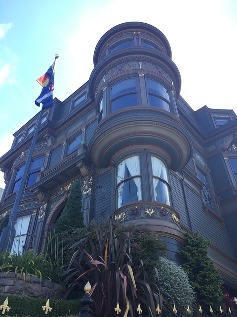
According to the Planning Department, this beautiful Queen Anne Victorian was built in 1895 by John Daly (yes, the man Daly City is named after) and was recently restored in 2009. Confession: I’ve wanted to live in this building since the first time I saw it years ago.
Since this building is built into a hill it’s possible to view it from many angles, but I prefer looking up to it from here because it emphasizes that gorgeous tower.
That’s all thirty! If you’d like you can also view these photos in this Flickr album.
