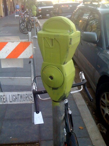
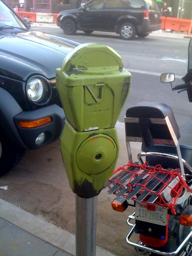
Slimer paid a visit to a string of parking meters along Valencia today. It seems ghosts don’t like paying for parking.
-
Muni Diaries Live: Breaking it Down
Last night Muni Diaries hosted their third live event, Breaking it Down. It was just as entertaining than last time, although the Make Out Room over capacity this time around. Next time they may need a larger venue.

If you didn’t go, here’s a quick list of what you missed:
- Cock-Ts performance
- Poet (and genius!) Silvi’s pleasant run in with a fare inspector
- Vero Majano’s Muni karma
- Bart operator Kelly Beardsley’s tales of oddness on Bart
- McPuzo and Trotsky performing Muni-related songs
- Bart romance with Muni Diaries’ Suzanne
- Several short stories from members of the audience
- Comedian Will Franken’s encounters on Muni
- Final performance with the Cock-Ts
Some more photos, courtesy of Alexia Anthem:


-
4chan infiltrated Noisebridge
Oh dear, the Anonymous meme junkies at 4chan seem to have infiltrated San Francisco’s hacker-den, Noisebridge, with a variety of meme-stencils.
-
Trees going in on Valencia St
New dog urinals awesome trees are going in on Valencia St. as part of the Valencia Streetscape Improvement Project.

In the above crappy iPhone pic, we see workers on Valencia and 16th installing a new tree to provide shade to the already shady payday loans place.
Hopefully this will all be worth the trouble someday.
-
The truth about 9/11
After all the lies, the cover-ups, and the conspiracies, are you ready to look past the wool the government has pulled over your eyes and see for yourself?
Are you ready for the TRUTH about 9/11?
TheTRUTH
~
about
~
9/11
.
.
.
Here it is:
9/11 = 0.81818181 (etc)
Yup, that’s it. If you don’t believe me, try a calculator.
-
Never follow the instructions on a bottle of shampoo
You’re in the shower, and it’s time to shampoo. You flip the bottle around to read the instructions, and inevitably find the following:
Lather, rinse, repeat.
Let’s break this down into a flowchart.
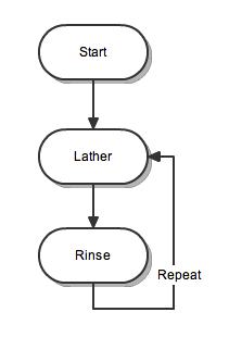
Do you see the problem here? Nowhere does it state when you should stop shampooing. In other words there’s no “stop condition” in this set of instructions — it doesn’t say “repeat if your hair is still dirty,” it simply says “repeat.” Always. Forever.
If you follow these instructions, you will be in the shower for the rest of your life! I hope you’ve stocked up on enough shampoo to last until you starve to death in your shower of doom, lest you run out and be unable to follow directions.
But at least you’ll be clean when the coroner arrives.
No, the only choice you have is to NOT follow directions. You simply must disobey your shampoo bottle if you wish to live. It’s that important.
This conundrum calls into question many other instructions that you may follow blindly. If shampoo has misguided us, should we trust other directions? Maybe you should operate heavy machinery after taking NyQuil. Maybe you should let babies fall into plastic buckets. Maybe our pets should go in the microwave.
If we’re ever to trust product directions again, they’re going to have to change. As a first step, the shampoo manufacturers need to admit that we do not need to spend our lives trapped in the shower, lathering and rinsing.
Shampoo manufacturers, take heed: you need to add a stop condition to the directions to tell us when to stop and get out of the shower. Our lives are at stake. Thank you.
-
Best free Wikipedia app for iPhone
Chances are, if you don’t have an iPhone, you live in cabin in the middle of the woods — in the year 1812. The iPhone is everywhere these days. You’re probably reading this on one right now.

And since the almighty JesusPhone has internet access, it should be a great way to browse Wikipedia. But it’s not. Why? Well for starters, the iPhone’s built-in web browser is painfully slow, like a child pedaling their tricycle down the freeway. And to add insult to injury, the Wikipedia mobile site is completely awful, with unnecessary page reloads and a funky layout that makes it hard to use.
But here’s the thing: there’s a zillion apps out there for reading Wikipedia on the iPhone. I decided to download all the free ones I could stand and give them a test. Why only the free ones? Well there’s the fact that I’m a cheapass, but also Wikipedia itself is free and it just seems wrong to me to buy something to read free content. It’s like one of those scams where you get a “free gift” but then you have to pay for shipping and handling.
I’m testing NINE different free apps. And I’m not just going to load it up and say “Oooh, shiny! 10 stars OMG yay!!!!11” like those other reviewers do. No, I’m going to be a hypercritical hard ass. Let’s get started by looking at the official Wikipedia iPhone app.
Wikipedia (official app)

This app is slow and strangely designed. It’s almost like using the Wikipedia mobile website — no wait, it’s EXACTLY like that, except Safari has a different color scheme and more features.
Features: none really
Rating: EPIC FAILWikipanion

Yet another app that’s just a small skin over Safari. It’s like someone took your web browser and rearranged the buttons, and made it so it could only access one site. There’s some minor additions, such as quick search, but nothing notable.
Features: Wiktionary integration, search in page, quick search
Rating: *yawn*Wapedia

This one is an improvement over the default app, but only slightly. They added some bullshit with social networking that nobody will ever use, and added a sort of nifty full screen mode that works just like the NY Times app. But sadly there’s distracting ads at the bottom of the screen.
The quick search in this one is one of the most obnoxious, it’s too responsive. You type in one letter and it starts searching instantly. Very off-putting.
Features: Quick search, page cache, image toggle, full screen mode, some social networking crap
Rating: Meh…Quickpedia

This one is about as confusing as they come. It’s like the developer didn’t care at all where the buttons went. On any given page if you scroll to the top, there’s an “Options” tab, which lets you change the font size as well as go to another screen called “Settings.” Yes, they seriously made a distinction between “Options” and “Settings.” WTF?
Even worse, between “Options” and the article there’s giant button that takes you to a random article, as if that were somehow the most important feature. I’m bored enough to review Wikipedia apps, and yet I would never be bored enough to use this button.
The “Nearby” feature was kind of nifty, but not enough to make up for the terrible interface.
Features: Quick search, nearby articles, Wiki News integration, WTF interface
Rating: NO!Wikihood

This application only shows you articles about nearby places. Or it crashes. But when it does work, it just shows the page in a skinned version of Safari with no bells and whistles.
Features: Nearby articles, frequent crashes
Rating: Could be worse. But then again, even Hitler could have been worse.Handy Wiki

All this app really adds is a quicker search to Wikipedia. It looks sort of like a mutant version of the address book on the phone when you search. And it’s actually quite fast. But it’s all moot because the article view is obstructed by a big add at the top which is superimposed over the article. Also, the images can make the screen too wide to hold the column, and you end up scrolling left and right just to read the goddamn thing.
It’s not at all well thought out. Maybe there’s no thought put into this app at all, I can’t really tell.
Features: Quick search feature, obnoxious advertising
Rating: You fail at failing (and that’s not an oxymoron)WikiWiki

Much like Handy Wiki, this one has a quick search feature. But the difference is that the results are presented in an utterly confounding fashion. First it shows the “full text” search, which tends to be garbage that has nothing to do with what you’re looking for. You have to scroll down to find the “title results” which is probably what you wanted.
The article view is okay, I’d give WikiWiki a slight mark above above Handy Wiki because the ad placement is more reasonable and the width works correctly.
Features: Dumb name, quirky quick search feature
Rating: Maybe…Wiki Tap

You definitely get what you pay for, this app is totally barebones. There’s not much of anything here that you won’t find on Safari, with the exception of the Nearby feature, the quick search, and a few quick links at the top of the screen.
But on the plus side, the few features this app has actually do work. So it provides a small step above just looking at Wikipedia in Safari.
Features: Nearby articles, quick search, links to videos
Rating: Eh, I’d use itWikiamo

Much like Wiki Tap, but even more barebones. There’s no Nearby feature, for example.
But in spite of the few features, nothing really works right. The quick search worked fine for me the first time, but the second time I used it it changed my language to French. Qu’est-ce qu’un tas de merde! Then there’s the rotation. Prepare to wait 30 seconds if you tilt your phone slightly, because that’s about how long this application takes to flip the orientation. Lame.
Features: Quick search
Rating: Merde.Conclusion
There’s some terrible apps out there, but the good news is they’re free. Then again, time is money so why bother with the bad apps? I already tried them out, therefore you owe me money. Think about it.Anyway, Wiki Tap has my vote. It has quite a few features for a freebie app, the most useful of which is the quick search. If you’re going to use an app, use that one. But remember: with great power comes great responsibility. So no cheating on trivia night, folks.
-
Making beer at home: Part 3
This is a follow-up to part 1 and part 2 of my home-brewing series.
The final step, as you may have guessed, is bottling the beer. There’s not a whole lot too this: you put your bottles in the dishwasher, then bake ’em a little to sanitize them, fill them with beer via a siphon, and cap the bottles.
It’s a good thing this is simple too, because I didn’t get any photos during the bottling. It turns out that digital cameras require something called a “battery” which needs to be “charged.” Who knew?
To take a step back here, you might wonder “where do I get beer bottles?” Well it’s obvious — you drink beer and reuse those bottles. You’ll need about 50 or so dark pop-top bottles. The labels can be removed by soaking the bottles in your kitchen sink overnight in hot water. You can use a cap full of bleach for suborn labels. But the good news is you can keep your de-labeled bottles and use them again.
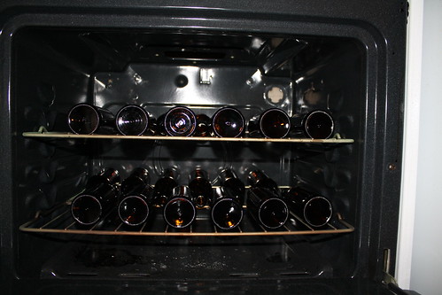
Here’s a pic of how the bottles get sanitized in the oven once they’re washed. You just place bottles on the racks of your oven, crank the heat to ~300 F, and wait for 20 minutes or so. This is actually more than enough to kill anything that survived the dishwasher.
The siphoning part isn’t very interesting, you just need a hose or ideally a hose connected to a pump. That part makes a huge mess but there’s not much to it.
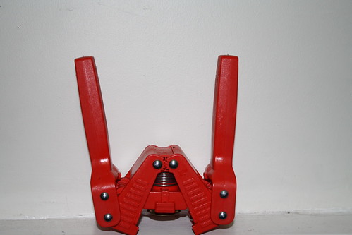
Everyone seems to be interested in capping the bottles. This crab-looking thing is the device that’s used for capping. You pull the handles and it pinches the caps on, and there’s a little magnet inside to hold the cap steady. It’s very easy, if you don’t mind a little hair in your beer you could probably train a monkey to do this part.
Important note to my Bay Area readers: don’t use Anchor Steam bottles! They seem ideal otherwise, but when attempting to cap Anchor bottles I’ve had nothing but issues. Usually the caps won’t snap on easily. One bottle actually broke while I was capping and I got glass all over. FAIL!
This concludes my brewing series. Perhaps I’ll have some other topics later if anyone’s interested.
About Eric
Travel, movies, comedy, tech, and whatever I find on the streets of San Francisco.
Follow this blog with RSS or on Bluesky.
Contact: mrericsir “at” gmail.com
Categories
Tags
16thmission ameritrip2019 art bart cats chicago clarionalley coffee covid-19 dolores park europe film food graffiti greece gregg turkington history humor immersive los angeles mission movies muni munimetro murals museums Music nonchalance northbaytrip2019 on cinema photos public transportation Rant restaurants san diego san francisco soma streetart television the jejune institute tim heidecker trailers travel videos wtf

